So while I wait for my renders to drop in, I thought I put together something interesting for my fellow 3D artists. This could also apply for other artists actually. This journal is about compositions, or anything related to compositions. Before I continue, I am not an academic expert at this. I'm just rambling here, I'm not even sure if this will be remotely useful, and many of you might already know all of this. Everything I say here is something I feel I've discovered myself, or adopted from things I've read in books or seen in video tutorials.
Composition
Where should we place things like, props, figures, lights, with respect to the camera.... or where should we place the camera? We can be absolute masters of materials, rigging, modeling and renderers, but if we don't pay attention to how to show off all our hard work, it will have been for nothing.
I am learning all the time, so everything that I say here is not some kind of school of thought. I therefore also might have a different take on composition than classic art schools have, but for me its about the way the picture is set up, where your subject(s) is (are) placed, where the light is coming from, field of view, balancing of contrasts, etc.
Why is composition so important?
We always seek order in things, we see rabbits in the clouds and faces on mars, it's the way our brain works. So a picture that makes it easier for our brain construct a mental reality will feel more enjoyable, much like suspending your disbelief while reading a nicely written fictional novel. If you don't pay attention to composition, chances are, even if your picture contains fantastically rendered subjects, the whole vibe of the picture might be off-putting, unless that is the vibe you're going for.
Easy on the eyes... or not?
The way i see it, it's like making headings, titles and paragraphs in a written/typed document,
you make it easier to read, distributing and illuminating (or not) aspects of a scene in such a way that it is easier to pick up, decipher, absorb. You're basically making it more accessible for the viewer, bringing things to the foreground, in the center, or off center, or even hiding things, and thereby communicating your message more effectively. Maybe you're actually making it less accessible, thereby also conveying a message of obscurity. Obscurity can make it scary, or unnerving, or it might accentuate things in the light, like with shadows. There are many ways in which to make a good composition, but it entirely depends on what you want to communicate. Even with
Lomography, which strives to appear as if no care has been taken in making a good composition with it's spontaneous approach, the best lomography pictures are still selected on composition, even if it was entirely shot from the hip.
How?
So how do you improve your composition? IMO, it completely depends on the message. Sometimes, depending on the message, the entire scene gets involved in showing this off: lighting, camera angle, posing, expressions, even the materials. Basically you can use anything in your scene, including the camera, to communicate as effectively as possible what is happening in your scene.

The Message, the style, and photography
All art has a message. It can be a strong one, or a simple one, mundane or aggressive, political or sexual. Even a girl bent over showing her hooha is a message, even if its a primitive one. Its your job to make sure this is communicated effectively with a renderer, or a camera, or even just a pencil. In my opinion there are a number of different styles of compositioning, and they all have a lot of overlap and they can be used simultaneously. You will also find that there is a tremendous amount of overlap with photography, and one of my first pieces of advice for anyone on how to become a better 3D artist, is
read a book about photography. It's basically exactly the same.
Immersion
This is the style that I use a lot. This is basically the style that puts the reader/viewer in the
same space as the scene. This means, let
reality guide you.
- Lights should be where you would actually FIND lights in real life, like actual lamps, candles, or windows, skylights.
- The camera should be IN the same room as the scene, preferably at human eye-level, and with either a human field of vision, or a real camera's field of vision.
One of the things I found VERY strange with many Poser/DS scene products, is that they sometimes quite simply missed a wall, almost like a sitcom stage. And I also saw many people utilizing this too, placing their camera like 400 miles outside of this room, then zooming into the scene, giving a totally flat picture of people doing something. That is one of the quickest ways to break immersion, because you're creating a camera angle that would otherwise never be possible if the picture was made in a real room. It's not a comfortable way to look at a scene, because nobody naturally sees like that, unless maybe through a telescope. If you want your picture to be believable, you need to go with what the real life version would allow you to do. Camera should be in a place where a human can be, or where a 'camera man' can be expected to be, perhaps even just outside the room, looking in through a window, like a voyeur, or just next to the scene, but still at human level, a human needs to be able to do it. Go too far and it will loose its intimacy but might add to the sneakiness, come too close and it will be too intimate, unless that is what you want. In my webcam series, the camera sometimes came very close to the subjects, in their hands, slightly distorting their face shapes, but I wanted it that way.


Emphasis: communication
Composition can help enhance the thing you're trying to communicate. I think this is best to describe using examples:
One of the most common tricks in the movie industry is the way cameras are used to help show the viewer who is talking. I use this a lot as well. The simplest example is the over-the-shoulder camera angle, in an intimate conversation, you point the camera at the person talking, over the shoulder of the one listening. Here Lucinda and Lali are talking about something in the
UK trip.


This usually works best when the conversation is already going, and their subject matter is becoming more specific, you reflect that in the way the camera behaves. When you have an intimate conversation with someone, you tend to focus on their face, and not on the surroundings. So with the camera, you're drowning it out. However, if they're doing something, like flying an aircraft, it helps to add in their actions, as in real life you'll probably also notice what they're doing with their hands. Here you can see Errol and Shanaya in the
UK trip having a conversation in the cockpit. First I show them together, then I show Shanaya being a pilot, then the cockpit becomes less important as they discuss something.


However, you can also ignore the over-the-shoulder trick to emphasize how the listener reacts to what the speaker is saying. Below are images from the
New Years Boat Trip, where Maria asks Laila a question...

...and then Laila answers with something funny, embarrassing Maria. The camera barely moves (slightly zooms in) and shows how Maria changes posture and also showing the reactions of the girls on the left. Keeping the camera still can effectively show how your subjects change from one frame to the next, and in this case it was how people respond to Laila's remark, adding to the humor of it. But we know it's Laila talking because Maria is looking at her, and Laila is pointing at her. The camera staying in the same place can also give the feeling that Laila responded quickly, and that the camera didn't have time to move away, making the scene perhaps even more candid.

However, then the camera moves away (not zooming out) to show how the rest of the group continues on the funny situation, and more importantly, how Laila does not, despite what the group is doing. With a simple moving away of the camera, Laila's character is even more emphasized.

What is also important is how we use zoom in cameras. Like I'll talk about below, zoom can be used to add depth, and imitate scenarios where you can imagine zoom being used, like a football game. But be careful using zoom in an intimate conversation because you'll immediately get the feeling that you're not there. Throughout the campfire scene, the camera mostly stays close to the people, as if the camera could be what anyone could see if they were one of the people sitting there, or if you were standing close by with a camera. Sometimes it will zoom out when they're talking about something general, or if there's a change of subject... or if I just want to show off the scene a bit more.


Emphasis: direction, speed, depth, shape, scale, heroism
Aside from helping to enhance the conversation and social dynamic between your subjects, the way you place your camera and your subjects, and your choice of props in your scene, can greatly emphasize other aspects of a picture. The following are a few examples:
Direction, depth, speed: by placing anything with clear lines in a picture in such a way that it relates to
perspective lines in a scene, you can greatly enhance various aspects such as depth, distance, speed or direction in your scene. I don't use this style that much, but it can also be used in a gunfight scene, showing where the gun is pointing at.


Emphasizing shape can be done by juxtaposing curves against straight lines. Here Laila's curves are accentuated by the straight lines of the doorway.

Here, I needed to show off Project Evolution's facial expressions, and I used a single light off to the side, in a dark room, at a very shallow angle so that the shadows on her face are deeper and therefore enhance her shape.

You can emphasize scale very effectively with pure camera placement and zoom. In the picture with Sen and the Dragon, the camera is fairly wide angle, but because it's pointing up from ground level, it accentuates the dragon's size relative to Sen, as it forces you to look up at the Dragon like Sen has to. Also, the '
Dutch angle' offsets any vertical lines in the render from the picture border and creates an unbalanced uneasy feel to the composition. Details such as the fog / haze also help add depth.

Contrary to wide angle, intense zoom can help emphasize the size of objects as perspective lines at a distance do not converge at the same angle as up close. It becomes easier to compare the actual sizes of things in a scene, and even more so if you use a small fStop (like 4.0) it will blur the objects in the background, adding the the depth of the image. Objects in the back will now appear to loom over the subjects in front.


Hoever, if you want to emphasize something that is small, you need to simulate a macro environment. Much like what the tilt-shift effect tries to emulate, you basically want to make the focal range so narrow that anything just before or after the focial point gets blurred out immediately. This is achieved with very small fStops (like 2.0). Note how Project Evolution's lil Pudgy Elf's face is in focus, but her toes aren't.

You can also use this trick to bring the focus to something in a picture, like here you can see Danielle's face is in focus, but her boobs aren't.

Although I don't use it often in this context, a technique used a lot in Hollywood movies, is angling the camera up at the hero / heroine, which helps to make them seem more virtuous (and sometimes the camera pointing down at the villain). I use this style more to make whatever the camera is pointing up at more threatening, like with the dragon.


Sometimes it helps to go along with the scale of the scene to make readers be more aware of the environment. So just like with the camera being up close and intimate with the campfire scene, if your story happens in a public setting, you can pretend as if the camera is being held by someone standing elsewhere at the airport, but still crop down to the relevant subject.

A trick I sometimes use is to combine zoom with a very right crop, and sometimes combined with props obscuring the subject. By zooming in, you add depth and perhaps the feeling of voyeurism. The tight crop can give an uneasy claustrophobic feel, like tunnel vision, or isolation.


Presenting, exposition or informing
In contrast to the previous styles, sometimes you need everything to be clear in one go, everything needs to be shown at one glance. This can be for products or reviews, but it can also be used in stories, like when you begin one. Many opening shots in movies will show a bird's eye view of a city, or a building, then you're immediately orientated. This might seem like a no-brainer to many, but many people forget to do this in their comics.
So like with Project Evolution, I needed to clearly show what she was all about. She's digital, she's got bewbs and she can bend like crazy.


But in the New Year's Boat Trip, when the scene changed from day to night, I needed to make sure that people knew where they all were, and what had happened to the environment. I started off with a wide angle of the scene, with every aspect of the scene represented in a balanced way. One third water and beach, one third forest and rocks, and one third sky, with the fire off center and a palm tree looming behind them in the dark star light. it is then that I move the camera towards the campfire, with almost the same focal angle, and still give an overview of the group, before moving in even closer to show you the conversation they're having. You now know where they are, you get a better sense of the environment.


Here we could speak about the
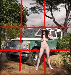
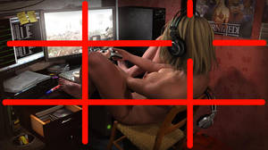
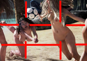
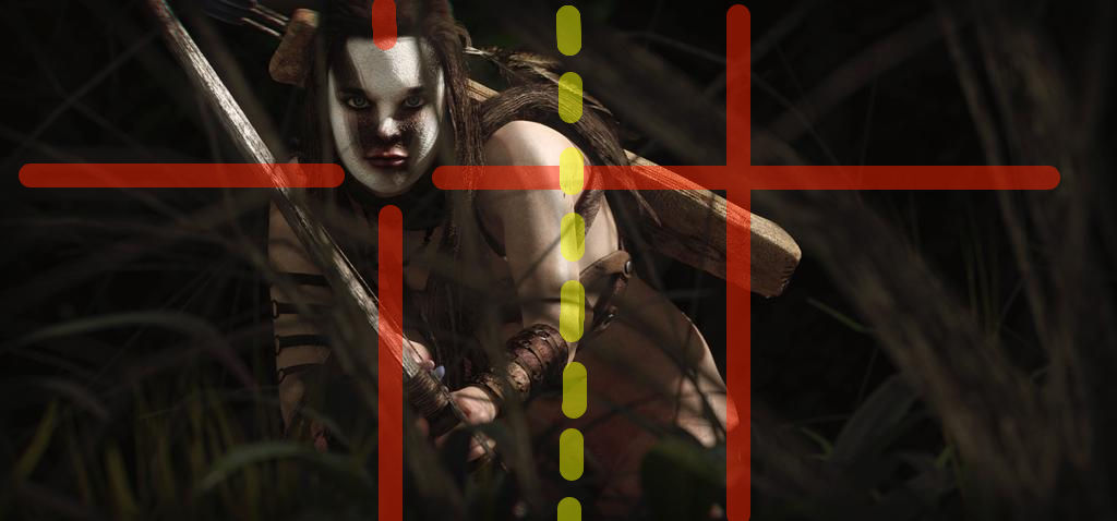
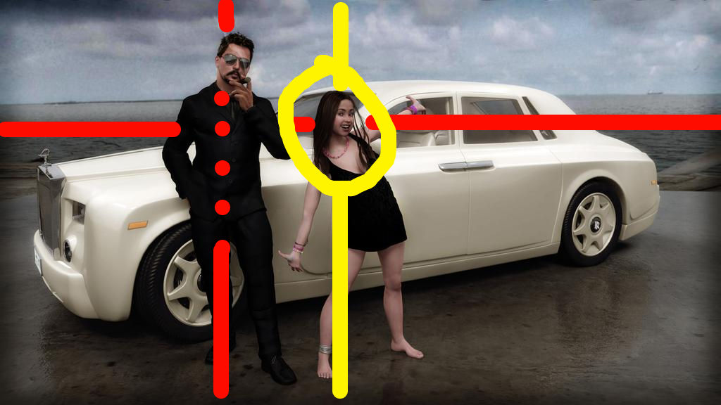
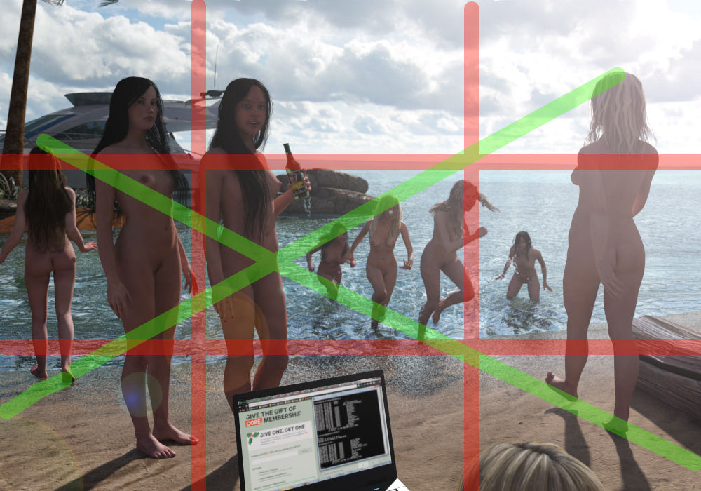
rule of thirds. Although I don't strictly adhere to it all the time, I do make an effort to always offset my subject away from the center. They say that rule of thirds helps to make an image more dramatic, that it gives more tension. Personally I think it's the opposite. I feel that if you put a subject dead center, it's a lot more threatening, or at least more intense. It's the same as focusing directly on your target during a fight, or if you're completely transfixed by a very sexy girl, the subject is squarely in the middle of your attention. So if you put your subject i the middle of your picture, you're basically saying, 'I am so entirely focused on you right now' and the rest of the picture does not matter. By offsetting your subject from the center you're permitting the rest of the scene to have importance too.


Or more threatening compositions that place the subject a little more towards the middle.


Or entirely in the middle:

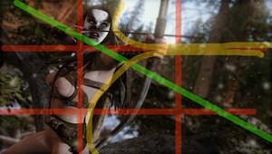
So as you can see I don't stick to it like crazy. Sometimes the scene demands a different approach. Of course you can go absolutely crazy with this rule and take it as far as some renaissance painters might have done, even going as far as including the
Fibonacci curve:

Wallpaper version:

or you can just take it casual like:

Because sometimes I do put my subjects in the middle.

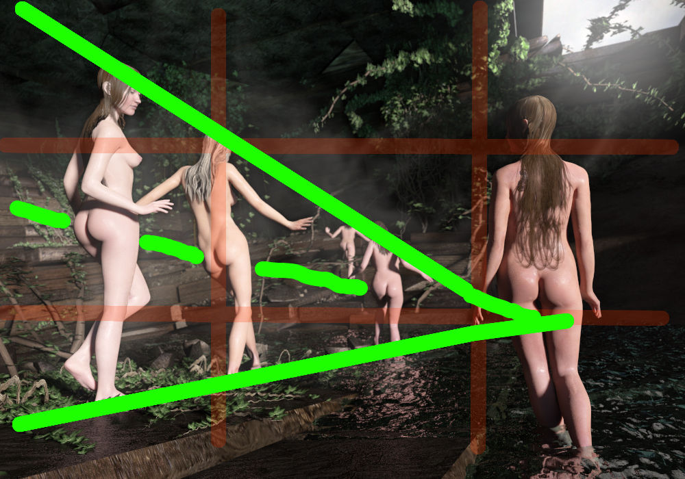
Sometimes it's fun to play with diagonal lines in your scenes:


Adding geometry like this to scenes, even simple ones, can add just bit of extra order in it, as if it was meant to be, even thought it's not immediately apparent. At first glance the scene appears chaotic, but without noticing it, there might be something that feels right about it, and that might simply be the placement of every subject.


Framing / cropping
Framing has a lot to do with compositioning, but it is its own animal in a way. Take for example portraits and landscapes: a portrait is a cropped, zoomed in, almost claustrophobic style of picture, whereas a landscape is wide, open, all-encompassing and perhaps overwhelming style of picture, but both can be done using immersive or enhancing or presentation compositioning. Although a portrait is not our natural field of vision, when we focus on a person's face, it might as well be a cropped portrait style image that our eyes capture, because we don't pay attention to the surroundings... especially if its a beautiful girl

Now you can make a portrait in her room, with all the lights where you'd expect them, or in a studio with strategically placed spotlights to accentuate her face shape, or just blast her face with light like with a commercial for make-up.


Balancing the composition (or maybe cheating)
Just like movie directors adjust the order of certain events to perfect the pacing and timing of a movie, balancing the slow and the fast moments, or the pacing in a novel, so does a picture need balancing, and you might have to shift a subject around to achieve this. Sometimes you want to emphasize the shape of a subject in your picture, but that could mean you might have to reposition the camera to achieve that. Or it might be possible that you've already got an excellent framing with all of the other subjects and you want to keep that... so that means you might have to actually reposition the subject a little. So do it. But remember, like with movies, you need to maintain the illusion of continuity, or the immersion will break. So use it sparingly. This might seem a little tough for purist artists, that feel that that would be cheating, like asking your subject to move to improve your photograph, but don't forget that this is about communicating your entire scene, and in CGI you are the creator of this entire scene, and not abiding by some cosmic law. Most viewers don't really care about any such rules, they just want to see a nice piece of art.
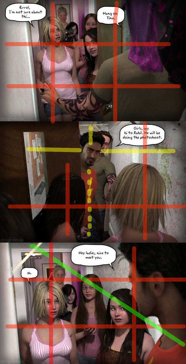
One recent example where I had to move around a prop a little bit was in the currently running House tour. I recently added a clothing line and at first it was a little too low as you can see here. I liked it since it added to the laid back nature of the house the girls live in. But in later frames I had to move the line up a but because it made the entrance of the gentleman very awkward. I on'e slightly moved it so it's hardly noticeable, but that is an example of how you can adjust your environment to improve the composition.


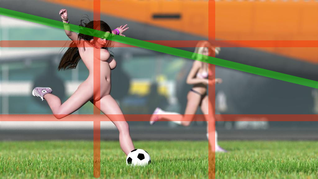
Below is a simpler example of cheating the scene, Christina is running at a distance behind Lali. I liked the hull of the aircraft cutting the scene the way it did, so I moved Christina up a little to compliment Lali's movement a little more, but not affecting the 'spontaneous feel' of the picture.

 edit: before you think I pose scenes and place things in a scene using a ruler and masking take and a calculator, I don't. Most of this stuff is so second nature I don't even think about it. Often it's about balancing a scene so that everything occupies a space naturally, and you can develop a feel for this quite easily. It's only afterwards that you can start to see patterns in what you make that you can describe as 'rules' when in fact it's just something you've felt your way through.
OK I need to stop here because this journal is becoming very difficult to edit now lol!
I hope this was interesting!
![]()
![]()
![]()
![]() - and ignore them
- and ignore them ![]()
![]()


